Circles Conference
Brand identity
Objective
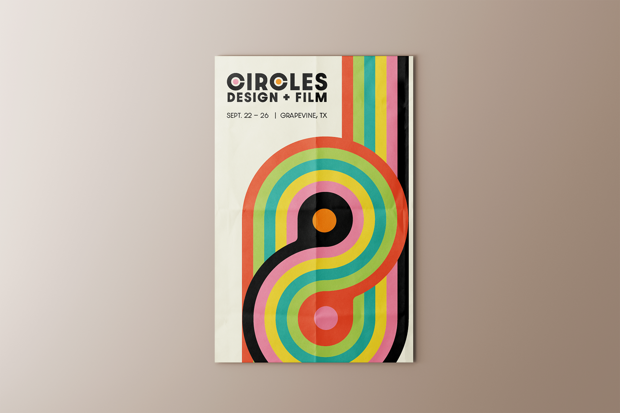
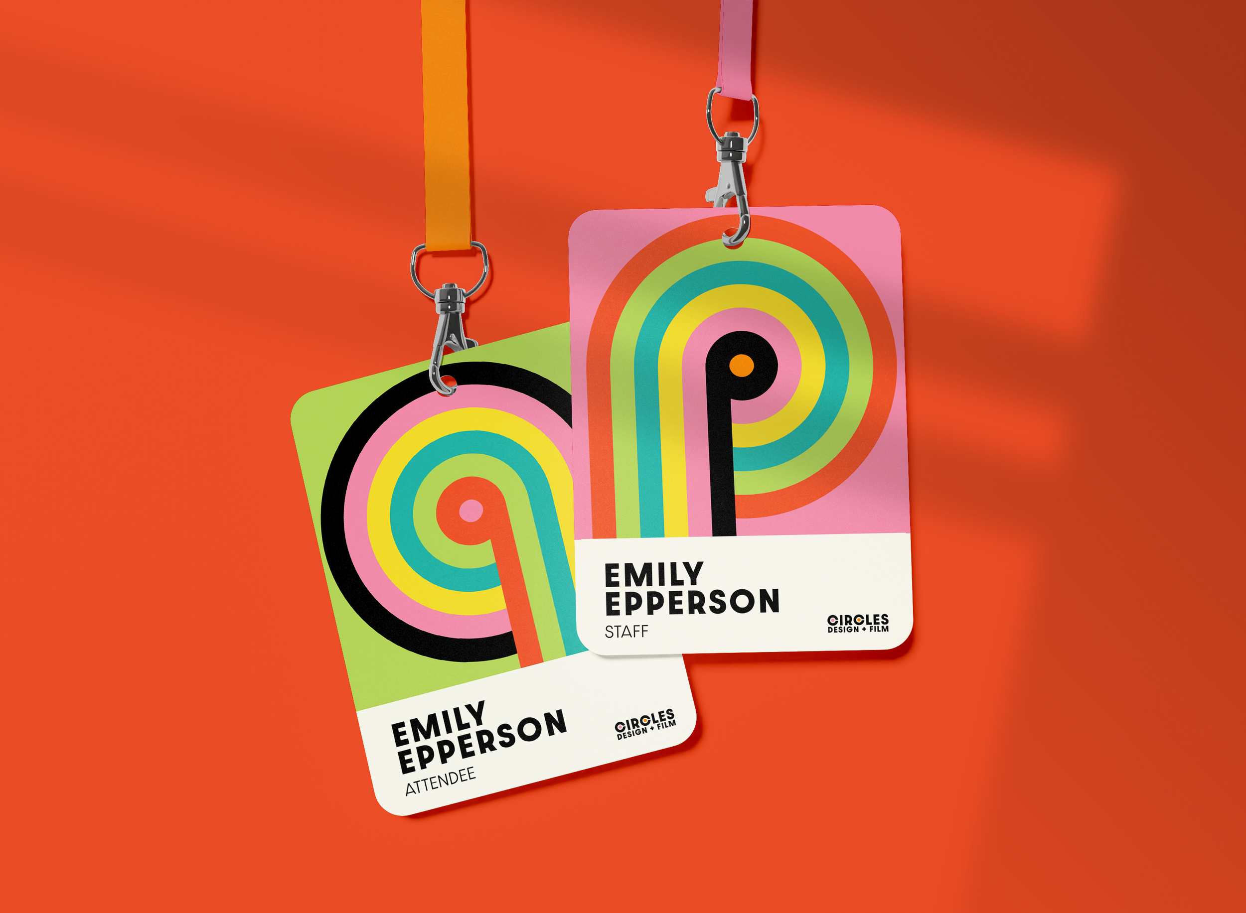
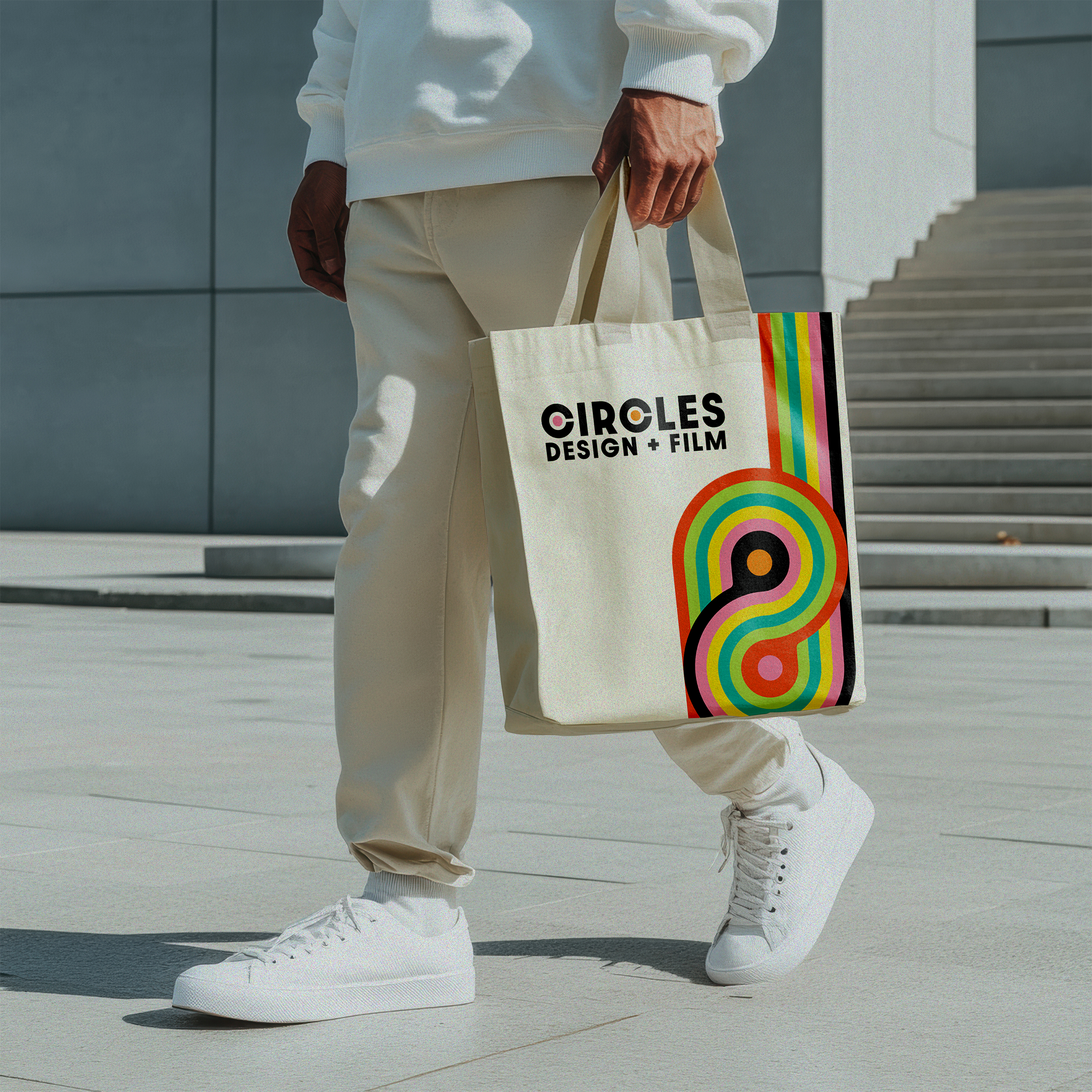
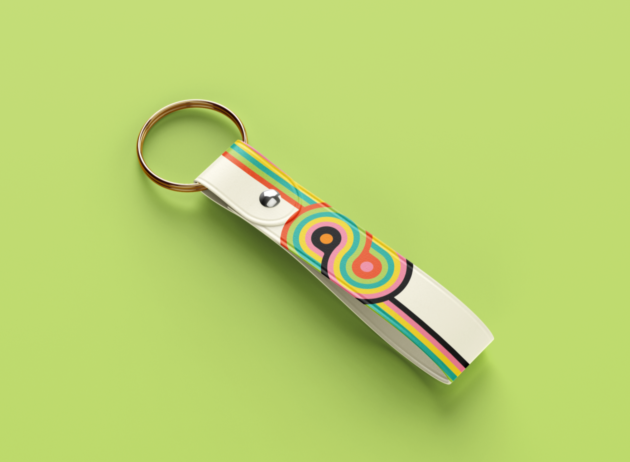
Design a range of event materials, such as a poster, badges, and merchandise for a creative conference.
Summary
Circles: Design + Film is a creative design conference by Circles Co., aimed at bringing together designers and filmmakers from around the globe.
Process
Moodboard
Sketches
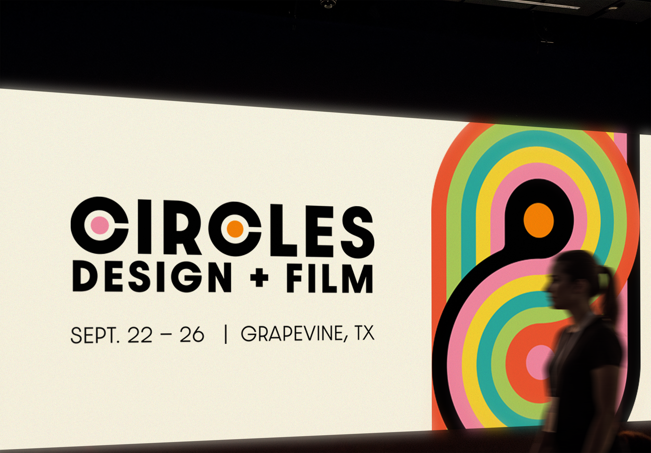
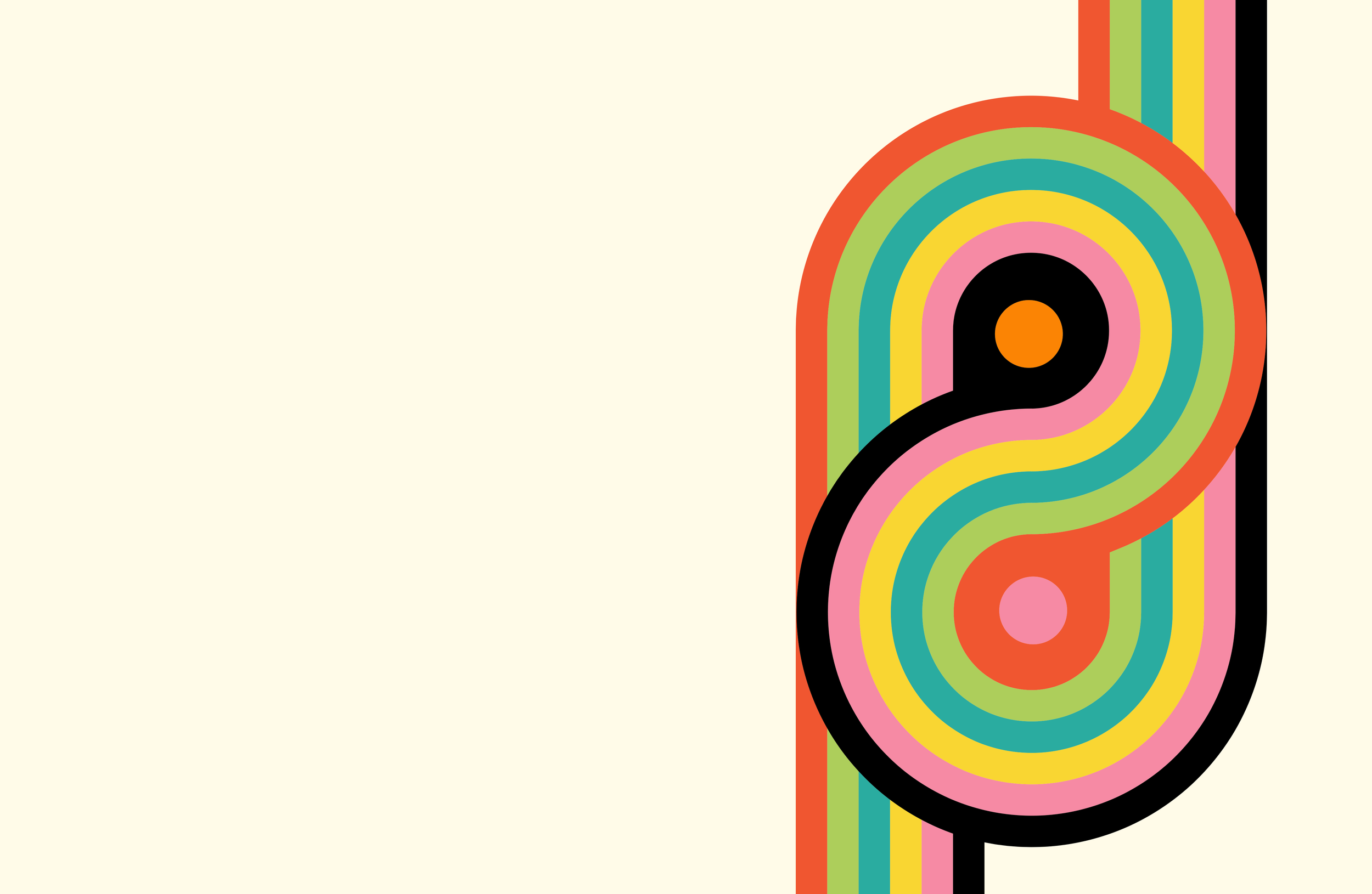
I wanted to create event branding that felt bold, colorful, and full of energy. Inspired by the conference’s name, Circles, I focused on using round, dynamic shapes paired with a strong, bold typeface. I drew a lot of inspiration from Bauhaus design, as I’ve always appreciated its use of simple geometry, clean lines, and balance to create unified compositions. My goal was to capture that same sense of harmony and playfulness in my design.
Digital Drafts
Revision
First version
(Created in class)
Revised version
(Created in portfolio)
This was a project I had originally planned to leave out of my portfolio, but I decided to take another shot at revising it, and ended up really liking the new direction. Although I appreciated aspects of the original design I created, I knew it wasn’t particularly distinctive and had room to be pushed further. So I decided to go back to an earlier idea that explored a more colorful, Bauhaus-inspired approach, and I’m really proud of where the final revised design landed and glad I didn’t scrap this project like I had originally intended to.
Final
