
Whitby Goth Weekend
Event branding
Objective
Create a poster and branding for an event with a focus on hand done lettering or customized type. Use type to develop a distinctive visual identity that captures the events essence.
Summary
Whitby Goth Weekend is a music and fashion festival celebrating the gothic subculture in Whitby, England, a place famous for its connection to Bram Stoker’s Dracula. The event features two nights of live gothic rock and over 100 alternative fashion vendors. Founded in 1994, it’s now one of the world’s premier goth festivals.
Process
Moodboard
Sketches
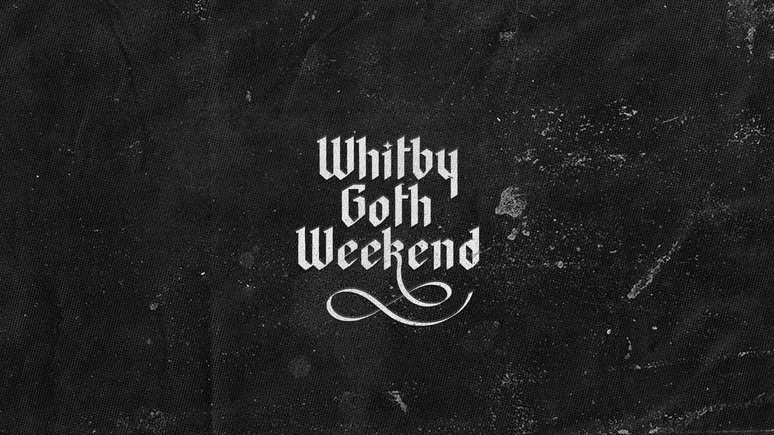
For this design, I drew heavily from classic gothic imagery, especially Victorian gothic elements like castles, bats, blackletter fonts and ornate decorative frames. I also pulled inspiration from traditional gothic horror novels such as Frankenstein, Interview With a Vampire and Dracula, a novel which is specifically tied to Whitby’s history. To stay true to the gothic aesthetic, I decided to keep the design in black and white. I also aimed to push the idea that WGW is welcoming place for alternative self expression.
Digital Drafts
Revision
First version
(Created in class)
Revised version
(Created in portfolio)
This project is one I decided to revise for portfolio class. Although I was proud of the modified lettering I had created in the original poster, I wanted to create a new version that felt more legible and interesting, but still preserved the same spirit the original had. I drew this new blackletter type completely by hand and redesigned the ornate border to feel more dynamic and flowy. I kept the black and white palette, the bat at the top of the border, and the use of texture from the original design, though I pushed the texturing even further to give the poster a richer and more visually compelling look.
Final


